Audiology SEO, Audiology Landing Page Design For PPC
-
Written on Saturday, January 31, 2015 by Geoffrey Cooling
Designing an Audiology Landing Page For PPC, How & Why
In a post a while ago we discussed a PPC experiment that we had undertaken to assess the effectiveness and value of PPC as part of an Audiology marketing strategy. Whilst the experiment was limited it did provide us with data and technical experience that was priceless. In synopsis, we found that PPC could be a very effective channel of marketing, but only under certain circumstances that could reduce cost and maximise ROI. There are many elements that will drive engagement that can be used on a website and we detail some on the post Website Elements That Drive Engagement. They all have value and can be considered for the design of a Landing page. Lets look at designing a good audiology landing page for conversion purposes.
Relevance of The Landing Page
One of the parameters we discovered from the experiment was the quality and technical Audiology SEO of the landing page. We found that the more relevant the landing page was to the advert and its copy, the better. Our relevance was very high during the experiment and it drove down our cost per click dramatically. You increase relevance by simply focusing on the message of the advert across the landing page. You optimise the meta title and meta description for relevance to the advert copy.
The landing page copy needs to be completely focused on the advert copy. You should ensure that you include keywords from the Advert in your h1, h2 and h3 tags when you use them on the page. The relevance of the landing page will also assist with conversion of viewers to leads. That is after all what we are trying to do, convert website viewers to leads. Certain design features also assist greatly with landing page conversion.
The Design Parameters
We have looked at relevance, that addresses one part of the equation, however a relevant landing page might not convert anybody unless it is designed to do so. So what design elements make a landing page effective? The principle factors are an adherence to the fundamental rules of conversion centered design:
- Use a clear and concise value proposition so visitors understand the purpose of the page immediately
- Focus the whole page on one single message, with one primary call to action (CTA)
- Use conversion design rules to make your CTA stand out (whitespace, color, contrast, directional cues)
- Use clear stand out social proof
- Use attractive visuals
- If you are using a form to collect data, keep the amount of information requested to a minimum
- Include all supplementary information (terms & conditions, privacy policy, product details) as opposed to sending them to your website (which removes them from your intended conversion path)
Lets look at those elements a little further, first the clear value proposition. The headline needs to be very simple and leave no doubt about the purpose of the page and the product. You should then reinforce the headline with a well written explanation of some of the core benefits directly below.
Concentrate on one single CTA (call to action) you may display it several times in different formats with different wording but the CTA has to be focused on one single action. This is not a do this or that oh and look at this exercise, a landing page should be focused on one single action you want your viewer to take.
When designing the CTA you need to ensure that it stands out, consider the use of whitespace, color, colour contrast and directional cues. We nearly always use contrasting and obvious CTAs in Audiology Engine designs.
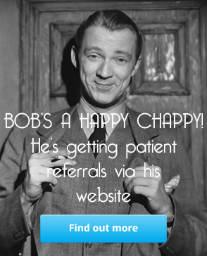
Using social proof on a landing page is also a must, again at Audiology Engine we try to ensure that there is a social proof element on every page on a website. Social proof is a powerful tool if used properly. Try to highlight the testimonial in some way, again contrasting colour and size of text can be used. Always try to use an image of the person giving the testimonial. Images add real power.
Your choice of imagery on your landing page is important, it should be product or message related. Consider that carefully though, a great image of a happy couple of our target demographic can be message related. The imagery just has to be in context, it doesn’t have to be industry related.
If you are using forms on any page whether it is a landing page or not, it should only ask for the least amount of information you need to fulfill a task. On a booking form, the information requested can be as simple as a name, email address and phone number. the information that you ask for needs to be balanced with the perceived value of the item being given in return. If you are offering a download for instance, what is the value of that download to the viewer? Not just that, what stage of the journey to purchase is that download designed for? Answer these questions and you will understand how much information you need and how much they will be willing to give.
Explain everything pertaining to an offer on page, all of the terms & conditions, your privacy policy, product details etc. You have designed a funnel, don’t give them a reason to go off funnel looking for information.
Audiology landing pages are important, they are the conversion drivers on your website. The elements that we have discussed here are useful for the design of any web page, not just your landing pages. However, we really need to use them to their best effect on landing pages.